But does that mean we totally ignore whitespace?
Likely not.

After all, we’re living in the post-RankBrain era where your search ranking depends on visitors’ satisfaction level. If they aren’t satisfied, Google will bury your blog.
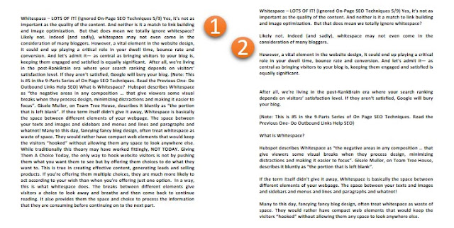
What is Whitespace?
Hubspot describes Whitespace as “the negative areas in any composition … that give viewers some visual breaks when they process design, minimizing distractions and making it easier to focus”.
Gisele Muller, on Team Tree House, describes it bluntly as “the portion that is left blank”.
If the term itself didn’t give it away, Whitespace is basically the space between different elements of your webpage. The space between your texts and images and sidebars and menus and lines and paragraphs and whatnot!
Many to this day, fancying fancy blog design, often treat whitespace as a waste of space. They assumingly would rather have compact web elements that would keep the visitors “hooked” without allowing them any space to look anywhere else.
While traditionally this theory may have worked fittingly, NOT TODAY.
Giving Them A Choice
Today, the only way to hook website visitors is not by pushing them what you want them to see but by offering them choices to do what they want to.

In a way, this is what whitespace does. The breaks between different elements give visitors a choice to look away and breathe and then come back to continue reading. It also provides them the space and choice to process the information that they are consuming before continuing on to the next part.
Benefits of Whitespace
-
- Whitespace gives readers a breather from all the information you’re offering
-
- It gives them time to think, which adds to the interactivity of your website
-
- It adds to the clarity of what you’re saying, both visually and contextually
-
- A clean, clear and organized space makes your blog even more attractive
- It separates different sections of your content, creating a proper visual hierarchy
All these benefits make your blog visitors even more satisfied that eventually improves your retention rate.
The readers stay on your blog for more time, they are more likely to jump on to different articles and remain more engaged with whatever you are trying to say. These, directly and indirectly, affect your on-page SEO.

Tweak the CSS code (padding, margin, word spacing, and line height). That oughta do it. More whitespace between elements, higher will be the readability of the page, which will end up positively affecting your ranking on SERP.
P.S. Whitespace doesn’t necessarily have to be white. The background could be any color.
- Is Low Click-Through Rate Destroying Your SEO Strategy?
- What Is The Perfect Keyword Density Percentage?
- Your Font Is Hurting Your Website Ranking (Fix It!)
- Revamp, Repurpose Your Old Contents to Boost SEO
- Do Outbound Links Help SEO?
- How To Use Interactive Contents to Increase SEO Ranking?
- Robots.txt For SEO: How (And Why) You Must Use It
- Website Speed in SEO: Does Your Site Load in 2 Seconds?
