Okay, I lied.
I am sorry! 🙁
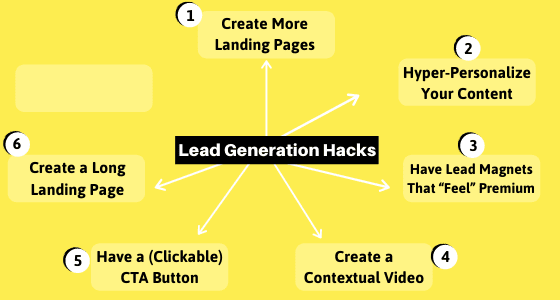
There are no 5 lead generation hacks.
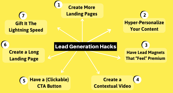
There are actually seven…
Seven lead generation hacks that are data-approved and (almost) guarantee to bring you upbeat results.
So, no matter how your existing lead generation strategies in 2023 look, incorporate these 7 hacks in them and unlock more HIGH-QUALITY leads.
Ready?
Let’s dive in!
1. Create More Landing Pages (And Then Some More)
Did you know that having more landing pages also increases your conversion rate?
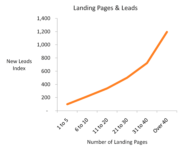
According to a study by Hubspot, businesses with over 40 landing pages generate 12 times more leads than those with 1-5 landing pages.
It’s not entirely a big surprise!
With more landing pages, you enjoy more opportunities to…
- Offer more lead magnets
- Increase organic traffic
- Engage the visitors
- Target diverse segments
- Provide visitors with more value
- Serve personalized content
So, how many landing pages do you have on your website to generate leads?
3? 5? 9?
You need more!!
Just increasing the number of your landing pages from 10 to 15 can increase your leads by 55 percent.
Now, of course, just having more landing pages itself doesn’t guarantee any result. What you present on and through those pages is what matters the most.
If your landing page copy and value proposition are poor, even having 500 pages won’t help you much.
So, the next obvious question could be something like…
What should these many landing pages be about? OR,
What kind of content do I include on these landing pages?
This is where the next lead generation hack comes in…
2. Hyper-Personalize Your Landing Page Content
Personalization is one of the most effective Conversation Rate Optimization techniques.
There’s a reason why 89 percent of digital businesses like Netflix and Fabletics are investing in personalization.
It can reduce acquisition costs by as much as 50 percent and lift revenue by up to 15 percent.
Even from more consumers’ end…
According to a report from SmarterHQ, 72 percent of consumers say they only engage with personalized marketing messages that are tailored to their interests.
So, creating tailor-made content that targets specific consumer segments is a smart idea.
Your landing pages must include personalized content that targets very specific segments individually.
Let’s take an example:
Say, you offer a Fitness Kit. The kit includes diet plans, workout routines, and other helpful resources.
Generally, you would target those people who are “interested in getting fit and healthy”.
So, you would create one landing page that outlines your products, features, and benefits – “Do you want to get fit? Sign up”
But then that page would be quite generic, won’t it?
Instead, you can hyper-personalize your landing page content and drive much higher conversion.
Your target audience “people who are interested in getting fit and healthy” can be grouped into many unique segments….
- Students who are interested in getting fit and healthy
- Teachers who are interested in getting fit and healthy
- Working professionals in their 20s who are interested in getting fit and healthy
- Retired people who are interested in getting fit and healthy
- The new mothers who are interested in getting fit and healthy
- Diabetic patients who are interested in getting fit and healthy
You can group your generic/broad target audience in many unique personas.
Now, which of these segments should you target? It depends on your product and market trends.
If your Fitness Kit isn’t meant for heart patients, you don’t want to address them directly.
If the number of students who are looking to get fit and healthy is less, you don’t want to focus a lot on them.
You’ve got to do some research here.
But anyway…
Once you know which segments of your broad target audience you want to focus on, now is the time to create unique landing pages that serve these segments individually.
This is what your “many landing pages” (as discussed in the previous point) should be about.
Instead of one generic landing page that says “Sign up if you’re interested in getting healthy”…
Have multiple landing pages with more targeted and personalized content, like “Just had a baby? Here’s how to get fit again” and “Don’t let that desk job ruin your health. Here’s how to get fit”.
Makes sense?
Great!
Have multiple landing pages.
Populate those landing pages with hyper-personalized content that targets your individual consumer segments.
Personalization is a very, very effective technique to convert and build brand.
The process sure takes a bit of time in research and content creation – but the BIG rewards are very much worth the effort.
Recommended Read: SEO Writing: A Guide To Create Content That Google Rewards
3. Have Lead Magnets That “Feel” Premium
Your lead generation pages must offer something valuable in return for visitors’ email addresses.
Generally, the lead magnets ought to be free. They can increase your opt-in rate by 85 percent.
BUT…
There are a few things that you must realize in order to drive higher conversion.
Today, a lead magnet isn’t just about delivering something for free. It’s just as much about building brand equity.
So, you shouldn’t have a dud proposition that doesn’t offer enough value to your audience. Or, at least, you shouldn’t exaggerate your promises and then fail to match the expectations.
Your lead magnet should be of high value (helpful and useful) that’s worth people’s time and effort. The better it is, the better your brand will be positioned.
And improved brand value inevitably leads to financial returns in the long run.
Now before you wonder about the lead magnet ideas, let’s address another thing…
You should have more than one lead magnet.
How many?
It depends on the number of segments you’re targeting among various other factors.
For instance, if you’re looking to capture the email address of working professionals in their 20s and those in their 40s – both segments have their own unique needs and requirements.
To target them efficiently, you would have to create at least 2 tailor-made landing pages with personalized content, as mentioned in the previous lead generation hack.
Each of these landing pages should also have contextualized lead magnets for higher conversion.
Admittedly, if you’re targeting 40 different segments, you cannot have 40 lead magnets. Unless you have a very large team, that’s very, very difficult.
But, in the end, the key is to have as many lead magnets to capture highly qualified leads as it makes sense. It would help you…
- Connect with individual customer personas better
- Widen the base of your target audience (you would attract more people)
- Convert a higher percentage of the visitors
- Allows you the room for A/B testing to improve conversion
Look at Hubspot. They have innumerable lead magnets – and each of them is pretty solid!
So, you should have multiple lead magnets on different landing pages to connect with the target audience and capture quality leads.
Pro Tip: Even when you’re offering the same lead magnet across all pages, make sure your landing page content is at least different. The content should directly address the segment the page is targeting and define how the lead magnet is unique and “just for them”.
Now, coming to what your lead magnet should be…
There are many options.
Ebooks are the most popular of all. According to a survey by Hubspot, 27.7 percent of marketers use them,
24.9 percent of marketers leverage webinars to capture leads; 21.3 percent use free tools for this.
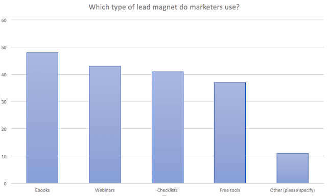
Other lead magnet ideas include VIP access, checklist, content upgrade, giveaways, discount coupons, case studies, consultation, resource lists, and spreadsheets.
Understand your needs first, your target segments, the individual personas you’re focusing on, and then come up with multiple lead magnets.
Let me end this with this…
Some of the common features of very good lead magnets include:
- Very valuable
- Focuses on solving a unique problem
- Offers immediate or quick solution
- Very specific or targeted
- Adds trust to your brand equity
4. Can You Create a Contextual Video?
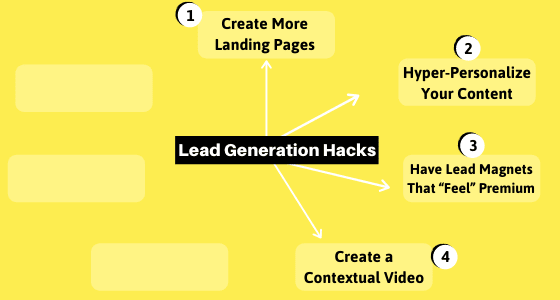
Because videos on landing pages can increase conversion by 86 percent.
So, can you include a video on your landing page?
Of course, many marketers and bloggers can’t. They don’t have the resources for this.
But before you shun away from this idea and jump on to the next lead generation hack, hear me out:
Here “video” doesn’t necessarily mean a high-end product advertisement.
It doesn’t mean a super-quality video.
Heck, it doesn’t even mean that the video has to be yours. You can embed any YouTube video that ideally suits the context of your page and lead magnet.
For instance, if the lead generation landing page is about the “benefits of a vegan diet”, you can embed a video explaining the science behind this diet.
Two things to remember here though:
- Avoid picking a third-party video focusing more on that content creator’s brand. (You want a simple explanatory video.)
- Avoid those videos that already have their CTAs. “For more information, please visit….” If it has a prompt like this, don’t pick it.
- Give proper credit to the owner/maker of that video.
Now coming to creating your own video…
This isn’t as difficult as it sounds.
Creating a slideshow-based video is super easy. You can use your PowerPoint for this. Check out this quick video by James Burchill…
Even Canva(dot)com now makes making video slideshow easier.
Create several individual images with texts on them. Stack them together to make a video. And put music in the background. It’s that simple!
There are also tools like Lumen5 that are very good and intuitive for making such videos.
If you can spend more resources on production, whiteboard videos are great. Sparkol’s VideoScribe is one of the best whiteboard video makers.
And then, of course, if you’re comfortable, you can also record yourself and post that video on the landing page.
Now coming to the content of your self-made video – what should it be about?
First thing, it doesn’t have to be long. Anywhere between 20 and 60 seconds is ideal.
Second, do not overthink this. This video won’t replace the text content on your landing page. It is just meant to complement it.
So, whatever problem your lead magnet solves, you can talk about that problem. You can focus on the solution.
Although it’s not a very good idea to talk about the product’s features (in this case your lead magnet), you sure can go this way if you don’t find anything better to say.
Focusing on the problem of the target segment is the best content/video strategy. It will help people relate and connect with you, which will drive them to give you their email address.
So, even if you can make the simplest video, make it and test it on your landing pages. It sure will increase your lead captures.
5. Have a (Clickable) Call-to-Action Button
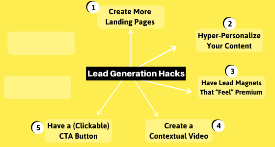
By clickable call-to-action button, I mean like this one…
Yes, I Love This CTA Button
It looks quite enticing, does it not? Much, much better than a dud CTA like “Click here”.
In fact, a few years back, CreateDebate found that making CTAs look like a clickable button boosted their click-through rate by 45 percent. (Source)
In addition, there are various other ways how you can make your CTA even more effective to drive more clicks.
One, personalized call-to-actions convert 202 percent better than the basic forms of CTAs.
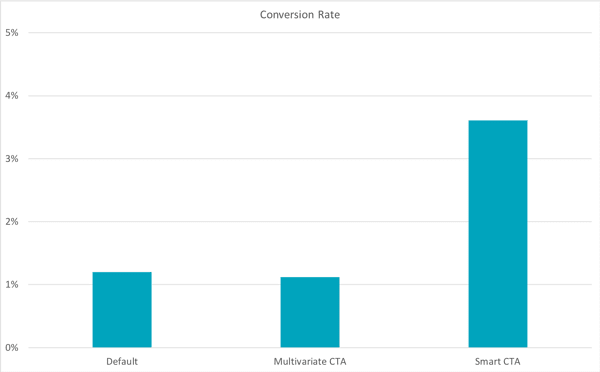
So, instead of going with “Click Here”, you should go with something more dynamic like “Yes, I’d Love To Read Your Emails” or “Yes, I Want Emails on Healthy Living”.
Keep the space around your CTA button clear and clutter-free. Open Mile found that reducing clutter around CTA increased their conversion rate by 232 percent.
As mentioned in the example above, you should use the first person in the CTA instead of the second person.
An article on Unbounce by Michael Aagaard explains that they saw an increase in CTR by 90 percent when they tested “Get my free 30-day trial” against “Get your 30-day trial”.
You can also use “hot words” in the CTA buttons like ‘Free’ and ‘Limited-Time Period’ and ‘Instantly’.
Also, you should regularly A/B test the color, size, and appearance of your button. Even a small change in the details can really make a big difference.
As for where you should place the CTA button…
It depends on the length of the page. If the page is long, there should be multiple CTAs throughout with unique phrases/copy.
One CTA above the fold and another one at the very bottom are almost given.
In the middle, after the end of every section, you can plug your CTA buttons.
A killer call-to-action along with personalized landing page content bounds to connect, create magic, and result in more lead generation.
Recommended Read:
- Above The Fold Content Optimization – 16 Best Practices
- How to Create CTA Button That Converts Big: 9 Actionable Tips
BONUS
6. Create a Long Landing Page
Long landing pages can generate up to 220% more leads than landing pages with just above-the-fold CTAs.
Now note…
This might not necessarily work for everyone.
Personally, I have seen long-form landing page content to be much more effective for lead generation in B2B.
Also, this tactic converts better for select lead magnets.
For instance, if your lead magnet is a quiz or calculator, creating a long landing page doesn’t make much sense.
On the other hand, if your lead magnet is an eBook, checklist, or case study, these do require a fair share of initial explanation like what they are, what they include, how they can help the audience, and so forth.
Generally though, you want to include as much content as you believe is necessary.
Explain in detail your value proposition.
This could easily stretch the word count to 1,200. And it’s adequate.
Also, don’t have your landing page just filled with texts.
While it should have a video, you should also populate it with images, gifs, illustrations, and different-colored backgrounds. This will make the page appealing and interactive.
Remember, viewers are 80 percent more likely to read content that features colorful visuals.
To that, split the page into clear sections and sub-sections so that it’s easy to skim and understand.
7. Gift It The Lightning Speed
This is quite given and self-experienced for all.
If you visit a website and it takes a lot of time to load, how do you feel? What do you do?
You’ll likely feel frustrated. And if the loading speed bypasses a threshold, you will certainly leave the website.
This is exactly what even the numbers suggest…
A 1-second delay can reduce your conversion by 7 percent.
Sadly, it takes 15.3 seconds for a mobile landing page to load. And people expect a webpage (desktop/phone) to load in 2 seconds or less.
In fact, 53% of visits are likely to be abandoned if pages take longer than 3 seconds to load.
So, after all is done and created, check out the speed of your landing page. Use Google’s PageSpeed Insights.
Ideally, you want it to load in less than 3 seconds. Anything more than that – unless you have a good brand positioning and your value proposition is very good/unique – it can cost you many leads.
If it’s more than 3 seconds, take appropriate measures to fix it and make it as fast as you possibly can.
Speed is essential to a good user experience.
And the better the experience is for the visitors with the performance of the landing and the content there, the more likely they will give you their email address or/and phone number.
Time For You To Do…
Admittedly, there are many other metrics that underline how your landing page should be and how to capture more leads.
The above-mentioned 7 lead generation hacks are the key.
They are free and they are tactical.
And if you manage to pull them off correctly, you’re almost guaranteed to convert big.
So, how does your existing lead generation strategy looks? How are your ongoing organic campaigns performing?
You can bolster your efforts and drive the desired result by following these 7 hacks.
Stop thinking and start acting.
Start by outlining different segments of your target audience, and then create unique landing pages for them one by one. Become a pro at lead generation.
Recommended Read: How to Emotionalize Marketing Campaigns for 10X Conversion
Good luck! 🙂
