It was never a secret!!
Just like what a cover is to the book, above-the-fold (ATF) is to the website. Both influence viewers’ judgment even without them reading/looking at the entire content.
Meaning, a large part of how the visitors behave on your website depends on the above-the-fold content of the landing page.
Above the fold definition
It is part of the webpage that’s visible immediately on your screen (desktop or handheld devices) without scrolling.
Below the fold is just the opposite. It is a portion of the webpage that requires scrolling to be seen.
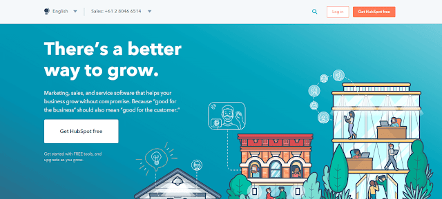
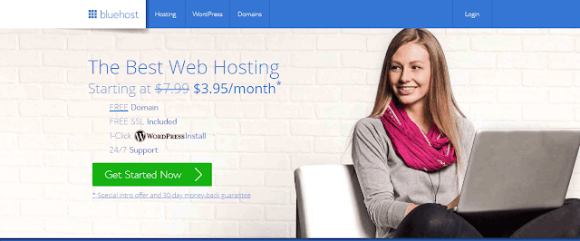
Here are a few above-the-fold content examples…
Hubspot:
Bluehost:
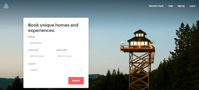
Airbnb:
The (New) Arguments Against It
Now before moving forward, we must address this…
In recent times, many people have come to chastise this tactic of generating a higher conversion. Many are even calling it a “myth”.
Google, in fact, suggests that above the fold is dead… 😐
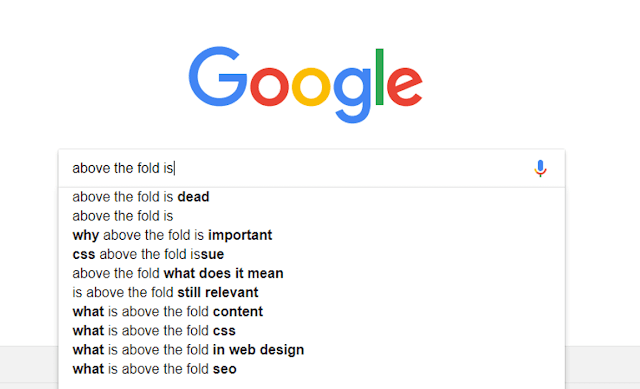
And there are a handful of studies that back their case.
Now honestly, they are NOT wrong.
Above-the-fold content with a giant CTA is NOT the best way to convert. But then again, it was never meant to be “the best”. And never did it guarantee higher conversion.
The basic idea behind ATF content has always been to grab the reader’s attention and not necessarily generate leads or revenue immediately.
Had this been the case, the newspaper would always have advertisements on the upper part of the front page and NOT the attractive (read: sensational) headlines.
This means, your above-the-fold content is primarily meant to grab attention, drive engagement and then strategically convert that attention.
And when talking about “strategically” converting “that attention”, this is where below-the-fold content comes to play a big role.
PEOPLE SCROLL!!!! Whether they have landed on a blog post or your homepage, unless they have come to your website accidentally, they will scroll.
So, contrary to what many people think, the facts are:
- Below-the-fold content is VERY important.
- Above-the-fold content doesn’t GUARANTEE conversion. It just improves its chances.
It’s much like when we write a blog post. When writing, we focus more on the headline and the beginning part (the first 100 words).
Also Read: 9 Blog Headline Best Practices That New Bloggers Don’t Use
Because these are the two components that hook readers up and create in their minds a perception about the rest of the blog post.
In a similar way, the above-the-fold content is about hooking the visitors and creating in their minds a perception of the rest of the page.
Your below-the-fold content must be in sync with this early “perception”, disclosing whatever you have to say/offer in a storytelling way where the Call-To-Action button can be placed anywhere, wherever it makes sense.
(Of course, CTA buttons need to be placed repeatedly and in a more visible way. But that’s a whole different topic altogether.)
What it REALLY Means
When you give away the traditional and somewhat narrowed idea of above-the-fold content, here’s what you need to establish and move forward with:
- ATF content is meant to grab visitors’ attention and engage them.
- ATF is NOT meant to bring DIRECT conversion. It must be used as an avenue that slowly processes the visitors from one touch point of the customer journey to another – and NOT throw them from being a complete stranger to your sales email.
- CTA Button doesn’t necessarily have to be included in the above-the-fold portion.
- Below-the-fold content is very important that must support your ATF content to take a visitor from one stage to another.
Also, one must note that different niches and goals have different dynamics.
For instance, it’s easier to make the above-the-fold conversion if you’re trying to sell a marketing eBook or build an email list than, say, if you want to sell cars or SaaS products.
So, to say that Above The Fold content doesn’t convert well anymore might be right. But then it was never meant to do that in the first place.
Its primary task has always been to help through the conversion process — and not necessarily make the direct conversion.
(Just like a fitness app is meant to help you get fit and not swooshingly burn your extra pounds in a minute.)
Still with me? Great!
What To Do Now
You want more conversion. This could mean anything — right from getting people to read a sponsored post and partake in a survey to grabbing their emails and selling them a product.
Your goals can vary.
Also Read: How to Capture Email Address of (First-time) Website Visitors?
However, there are few well-defined above the fold best practices that are universal.
Irrespective of your need and niche, if executed well, these practices will help you achieve what you’re looking for.
Now, of course, contrary to its mainstream perception, ATF content doesn’t “guarantee” anything, and neither does it promise the “highest conversion”.
There could very well be better alternatives that can drive you higher conversion.
So, when going for above-the-fold optimization, your purpose shouldn’t necessarily be to convert — but to facilitate a higher conversion.
Now how do you do that?
Following are the 16 actions you need to take for effective above-the-fold optimization:
Above The Fold Optimization: 16 Actions To Take Immediately
1. Define an exact goal (what do you want)
You want more monetary returns. Period.
But to achieve that, you need a systematic approach. Meaning to say, you need a well-defined sales funnel.
While, generally, lead generation is the biggest and foremost component of a sales funnel, it doesn’t exactly have to be that way all the time.
For instance, you can ask people to join your Facebook group. In that group, you can engage them and then sell whatever you’re selling.
OR, you can ask people to follow you on social media platforms. There you can provide them with occasional coupon codes, which can then drive you more sales.
(Follow Spell Out Marketing on Twitter)
So, the first step in above-the-fold optimization is knowing exactly what you want.
Do you want email addresses, do you want people to follow you on Facebook or do you want to directly sell to your visitor with no engagement in between?
Generally, it’s always a good idea to collect emails. And then automate a series of emails that engages the subscribers. Once engaged, you can push them your product/service.
But then it depends on your individual sales funnel.
So, know your exact goal — what you want to achieve through your ATF content. And then move ahead to shape your planning and strategies around that goal.
2. You need it to be eye-catchy and wow-worthy
This is quite an obvious one. People want good website design and layout.
In fact, according to Adobe…
38 percent of people will stop engaging with a website if its layout is unattractive.
Meaning, how your website looks actually shapes visitors’ opinions and perceptions of your brand.
Now, this simple fact puts an awful lot of pressure on the above-the-fold content BECAUSE a visitor usually takes only 50 milliseconds to form an opinion about your website.
In short, your ATF content can either make or break the deal for you.
So, you need to put in a bit of extra time and better concepts when designing/developing your above-the-fold.
Also Read: 5 Blog Design Trends You Should NOT Follow
There are no hard rules for this. How your ATF should look will largely depend on your goal and overall website design.
Here are a few basic tips to hit the chords correctly here:
- Make it big — it must take at least 2/3 of the screen if not the whole.
- Keep it simple and lightweight (remember, there’s beauty in simplicity).
- Avoid using large images. Also, don’t use videos in the background.
- Avoid too many color variations that are unbearable to the eyes.
- Say no to very “bright and popping” colors; they look bad on phones.
- Use one large heading and one body. Texts with too many different font sizes (like multiple heads) are a no-no.
These basic measures will do the trick for you.
3. An Impactful CTA
“Click Here” “Go Here” “Call Us” “Contact Us” “Get Started”
Such call-to-actions are boring. And honestly, they suck!
Imagine, if you’re trying to get your BFF to do something. Would you be this formal and dud? Would you be like “contact me” “call me” “please go here” and “Need Help?”
Not likely. Not at least all the time.
Your CTA must be hard-hitting, unique, and motivating, whether it’s above the fold or anywhere for that matter.
It must be CLICKABLE and drive people to take that action.
Of course, given the fact that your CTA phrase must be small enough and NOT a sentence long, coming up with something interesting and perfect could be quite a challenge.
This is where you need to go creative. So many top brands have done it!
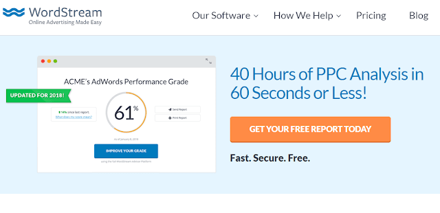
WordStream’s ATF CTA says… “Get Your Free Report Today”
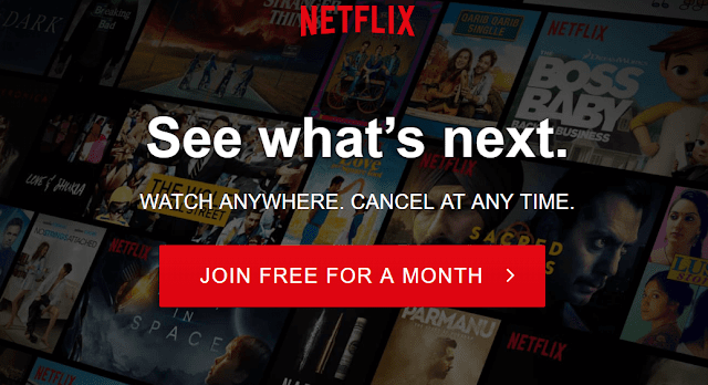
Netflix’s CTA is “Join Free For a Month”
There are so many other names from different niches that have very attractive call-to-action phrases. Some of the key features that high-converting CTA shows include:
- They are personalized. Many include “You” “Your” and “I”.
- They include the word “Free”.
- They are time-oriented and invoke urgency with words like “NOW” “Today” “30 days” “the first month”.
- They are encouraging and motivating
- They are short and simple. Nothing too fancy.
So, instead of going with the same, boring CTA, make it impactful. It can play a pivotal role in driving you higher conversion.
If you’re collecting emails to send newsletters, some of the interesting examples are:
- “I Want It NOW”
- Get Weekly Newsletters (For Free)
- Unlock Your Exclusive Newsletters
- FREE Emails Await You
- Exclusive Emails Just For You
Recommended Read: How To Create CTA Button That Converts Big: 9 Actionable Tips
4. Please (please) get rid of the sliders
It’s not 2012. And sliders aka carousel SUCKS. Big Time. So, please, please get rid of them.
They are very obnoxious. And multiple studies have found that they fill no purpose whatsoever, generating conversion as low as 1 percent.
The majority of website visitors do not even look at the sliders, let alone consider your multiple offers. So, you’re basically wasting away your ATF opportunity.
Plus, these moving images slow down the loading time, which affects UX big time.
To know more on this, read Instapage’s article on 6 reasons why image sliders are bad for conversions
So, if you still have sliders on your website, get rid of them IMMEDIATELY.
5. Don’t use large images
Sure, a single above-the-fold image looks quite appealing. And this, if used well, can work fine to grab visitors’ attention and then convert them.
However, there’s a drawback to it.
The ATF image, which usually is of high-definition quality, is large in size. And this can have a major effect on the loading speed of the webpage.
Also Read: How do you make image size smaller
This is where you need to weigh the pros and cons of using a large image above the fold. Are the benefits more than the minuses?
Personally, I love a solid background. No image.
But many don’t enjoy this preference. They are often required to use the image compulsorily to, say, effectively put forth their message.
In this case, it’s best that you use the image in the background using CSS vs. HTML. This will ensure the page’s speed doesn’t take a hit as much.
6. Make it load super-fast
Of course, the page must load very fast for obvious SEO and UX reasons.
But in this context, your above-the-fold content must be the first component to load in its entirety before the rest of the page loads.
You don’t want half of your ATF message load first and the remaining after below-the-fold content has loaded. Visitors won’t wait even for a second; they would scroll down.
This partial loading happens quite often due to render-blocking CSS and JavaScript. Also, poor coding at the backend is another major reason.
There are a few resources (CSS, JavaScript) that prevent the browser from rendering the page until it has completed rendering this particular source.
This usually leads to users either staring at the blank screen or accessing a half-loaded page – both of which are bad for UX and conversion.
Identify whether any source is blocking the browser from rendering the website smoothly. Use Google PageSpeed Insight for it.
Once you know the problem, you can take up a handful of measures.
One, get rid of those sources that are causing the problem.
Second, fix the codes. For instance, remove the unnecessary JavaScript from the header tag to the body. Also, optimize the CSS.
Third, use async and defer attributes to delay the parsing of unnecessary scripts.
You basically want the styles and scripts that are required to render ATF content, they must be delivered inline with the HTML.
Read Google’s own guide: Remove render-blocking JavaScript and Render Blocking CSS.
The key is that your above-the-fold content load first and faster.
7. It should be on your homepage…
…and not on blog post landing pages
Think of it: if you have clicked on a Google result to read a blog post and you’re being asked for your email right up front… Would you give them your email?
You don’t even know them!
So, it makes very less sense to put ATF Call to Action button on blog pages. People are visiting this page to read what your headline and description promised on SERP.
So, it’s best you provide them with exactly that!
(On post pages, the CTA should ideally be at the bottom. After people have read your post, if satisfied, they are more likely to signup or subscribe.)
So, avoid putting Call To Action in the Above The Fold portion of post pages. This should always be on the homepage.
8. Add more lines in the copy
People want to know what they are subscribing to or signing up for. They want to know what they should expect next.
So, simply saying “subscribe NOW” or even “Get a FREE Copy of *insert any product*” isn’t sufficient.
At least in the first fold (and once somewhere down), your call-to-action must be accompanied by a few more lines.
And these lines must be definite and personalized — instead of being vague like “change your life” or “Let us help you.”
- Address the problems of the visitors that you’re going to solve. “It gets tough trying to handle social media marketing yourself, doesn’t it?”
- Try to be empathetic and personalized in your copy. “We’ve been there. This is why *insert product name* exists in the first place.”
- Be extremely clear as to what the subscribers/buyers would get when they follow the CTA button.
ClickFunnels does this part fairly well. Look at their CTA which they have repeated multiple times on the homepage.

9. But keep it short and simple
With the above point being made, this is worth mentioning.
You must avoid being too wordy. Be succinct. Try to explain what you’re saying, comprehensively, in fewer words.
If there’s really a need to explain your proposition, add the “Know More” button and take people to a new page where you have explained things in detail. Or encourage people to scroll down for further explanation.
The above-the-fold copy must be sweet, simple, and small in length. 2-3 lines are more than adequate.
Anything longer than that risk losing people’s attention.
Here are some statistics from KoMarketing (taken from HubSpot):
- Once on the homepage, 86 percent of the visitors will look for information about the company’s products or services.
- Once on the homepage, 64 percent of visitors want to see the company’s contact information.
- Once on the homepage, 52 percent of the visitors want to see “about us” information about the company.
All these numbers clearly indicate just how important it is to have your navigation menu right up front in the above-the-fold area.
The menu bar must redirect visitors to all the important web pages of your website—product/service, about, contact, and more. This is essential.
11. What will subscribers get?
The visitors won’t act until they are told what they will get back in return for their action.
Imagine yourself: would you ever give your personal email to strangers for no reason?
So, in the copy, it’s essential that you clearly state what people will get – or where they will be taken to – after following the call to action.
Tell them what they can expect after hitting that button. Is it the email that they will receive “instantly” or will they be taken to the sales page where they can avail special discounts.
The surer they are about what they will get in return, the more likely they will act.
12. Make it easier to contact you
As the above stat suggests…
64 percent of visitors want to see your contact information once they are on the homepage.
For this simple reason, AI-based chats have become so popular for websites. Because visitors want to talk to you, understand what you’re offering, and converse about their needs.
This is even more important if you’re asking them for their emails or to purchase something. They would want to know.
So, your doors must always be open to them. And this must be evident. Right in the above-the-fold portion, you must make it clear that your brand/business is highly accessible.
Do this by placing a contact button in the navigation bar (and highlighting it by contrasting background), a floating contact widget, or a chat box.
And once you start getting messages, it’s equally important to respond promptly.
13. Ensure that it’s mobile-friendly
This is not just about responsiveness, but well beyond that.
For instance, the size of your ATF content must be adjusted to fit different smaller screens. If the ‘padding-top’ is ‘50px’ on the desktop, it should be adjusted to ‘padding-top: 25px’ for small screens.
Similarly, if the font size on the desktop is ‘22px’, it should be lowered to better fit the smaller resolution: say ‘18px’.
Also, you need to heed how the navigation bar looks and performs on small devices. Often, with such a small surface, clicking on the right option becomes a tad difficult.
Focusing on such minor details can come to play a significant role in enhancing mobile users’ experience, bringing you higher leads.
14. Say NO to the welcome mat (if possible)
This is highly opinionated.
Here is Sumo’s trademarked Welcome mat. Many renowned bloggers and websites use it.
While I do like how effective a welcome mat is, it also feels intrusive and overwhelming.
It slows down the website, hassles visitors from browsing the page, and shoves them an opt-in form that they might not appreciate.
According to Sumo though, a full-screen CTA like this converts three times more.
So, whether to use it or not should solely be your decision.
Having used it before myself, I wouldn’t trade UX for the welcome mat.
Instead, having an embedded opt-in is a much (much) better and faster option.
15. The Next Page…
When a visitor decides to act, where will your CTA button take her/him?
You’ve won them after a lot of hard work, losing them would suck. So, this is an important question. Your following landing page must be just as convincing and attractive.
If your ATF CTA was to sell a product, the product page, of course, needs to have all the right elements to convert. Including, product descriptions, reviews, and even a related video.
If you were aiming to generate leads, the next page must explain to them exactly what happens now — what they can expect and do right now. Provide them the clear navigations to head back to the main section of your website.
Also, you can provide the email submission confirmation on the same homepage with an overlay popup without any new redirect.
16. Good below-the-fold content
Your above-the-fold content won’t be sufficient to convince and convert visitors. Or, maybe you’re encouraging them to scroll down from the front to, say, explore more before acting.
This is why the below-the-fold content needs to be very good and well-thought to keep (subtly) pushing visitors to take action.
This is why, as mentioned, your CTA button (and section) should be consistently repeated on the page.
Below the fold, you can give further explanations about what you offer, who you are, and what problems you can solve.
You can show your social credibility by touting numbers of likes and followers on social media platforms.
Including videos, reviews, and testimonials is a good idea. Also, you can have that “as seen/featured on…” section to build credibility and trust.
Remember though, don’t be too pushy to convert. It’s okay if visitors don’t act to your CTA button. Empathize with their choice and look for another conversion opportunity.
Conclusion
These are 16 above-the-fold best practices that, when combined, can measure up your conversion to newer heights.
Indeed, some of them aren’t universal. They might not work for every niche, business model, and conversion goal.
So, you need to find out what ideally fits you.
The simplest way to do that is to just look at your successful competitors and see what they are doing. Observe their above-the-fold strategy and copy it with your own unique ideas.
For me, on Spell Out Marketing, adding a full-page above-the-fold opt-in form on the homepage came to have a big impact on my email list.
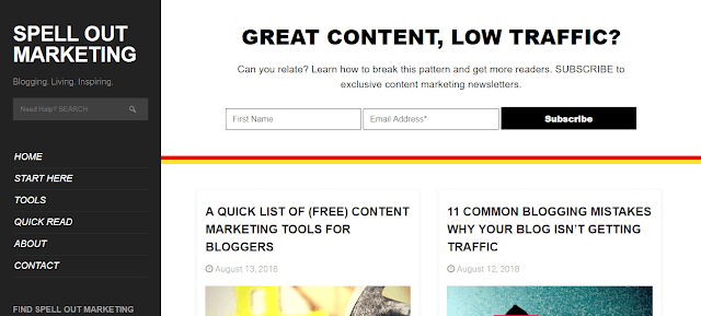
Here’s how the homepage ATF of my blog looked until early September 2018…
And here’s how it looks now:
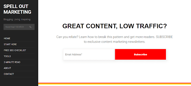
As you can see, I have removed the distracting blog post titles that were previously there above the fold. I made the opt-in portion very large so it grabs more attention.
I eliminated the “First Name” field and started focusing just on the email address. (There’s no reason to ask visitors to do more than they should!)
The result?
Here’s what my Mailchimp analytics read now:
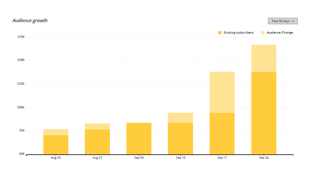
(Screenshot taken: Late September 2018)
A big boost in the number of people subscribing!!!!
Right now, I am trying to improve things below the fold to give visitors another chance to subscribe once they have scrolled down.
But adding an opt-in at the bottom won’t look aesthetically appealing. *pulls hair*
Nonetheless.
If a small change like what I made in the ATF can make such a big difference, you can seriously boost the conversion rate if you follow the above-mentioned above-the-fold best practice.
I genuinely hope this post brought you value. If it did, please share it on social media. 🙂
