A good CTA button is much more than just about navigating visitors from one page to another.
In itself, it should be compelling enough to hook people’s attention and get them to take that action.
It’s not easy, sure.
But with the right approach, you can make it happen.
And that’s exactly what this blog post will teach you…
Here are 9 actionable tips on how to create CTA button that increases your conversion rate:
1. Cut The Clutter
Open Mile did a study. They found that reducing the clutter around the CTA boosted their conversion rate by 232 percent.
So, have enough whitespace around your call-to-action button.
Avoid the distractions around it.
Make sure the CTA looks visible, clean and organized.
Kill the crowd.
2. The Size Does Matter
There’s no hard rule as to what should be the size of your CTA button.
But it sure is something quite important in grabbing attention and convincing people to convert.
When deciding on the size, make sure it complements the other elements on the page as well (including the size of the font).
The key is to make the size of CTA big enough that it stands out on the page, drawing significant attention.
The average size of a CTA button is 47.9 pixels.
3. Paint It Right
Generally, the color of your CTA button should match the aesthetic of your brand logo.
However, you might still want to test with different shades to see which one is more impactful.
After all, along with the size, the color is equally important in attracting attention.
Performable tested the color of their CTA button on the homepage. They found the red button got 29 percent more clicks vs. a green button.
Similarly, in their own case study, SAP found that orange call-to-action increased their conversion rate by 32.5 percent.
Do test with the color of your CTAs a few times. See which one brings you high conversion.
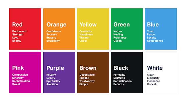
When testing, also consider the psychology of colors and what they convey.

(Source)
4. Make The Button Look Stylish
Aside from its size and color, there are a few other things you can do with the CTA button to make it more appealing.
There are ways to stylize it.
You can try plenty of different hover-over effects. Like…
Your Call to Action
Or this…
Your Call to Action
Or this!
Your Call To Action
This one is my favorite!
Your Call to Action
You can copy-paste the code of these hover-over effects from here.
5. The First-Person Personalization
Personalized calls to action convert 202 percent better.
Moreover, it’s even better if the personalization is in first-person.
Michael Aagaard explains in an article on Unbounce that changing “Start your free 30 day trial” to “Start my free30 day trial” increased their click-through rate by 90 percent.

So, ditch the boring “Click Here” and “Register”.
Personalize it with more context. Replace “You” and “Your” with “I” and “My”. It is one of the CTA button copy best practices.
Note: Of course, you should keep an eye on your CTA button length. You don’t want it to be too long.
6. Ensure It Looks Like a Clickable Button
This whole post is about how to create CTA button that converts – “CTA button”. Meaning, I am talking about a button and not anchor text.
But if it wasn’t already clear, let this point make it…
You want your CTA to look like a clickable button.
CreateDebate found that making their CTA look like a button increased their clicks by 45 percent.
7. Have It Positioned Well
Depending on the size of the page, you should have multiple CTA buttons throughout the page that have the same objective.
One should be placed above the fold. And one should be at the bottom of the page.
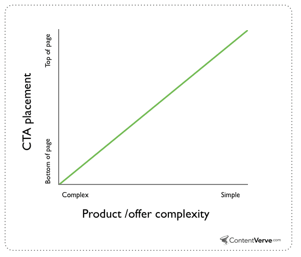
Here’s a simple rule…

If what you’re offering is complex and requires time to explain, your bottom-of-the-page CTA would be more effective. If it’s simple and doesn’t require explanation, above-the-fold CTA would do the trick.
If you want to learn more about best practices for the CTA button position, Zoho has a very thorough piece on this. Check it out here.
Recommended Read: Above The Fold Content Optimization: 16 Best Practices
8. Use Some “Power Words”
It’s no secret that some words are more powerful and convincing vs. the others.
In your CTA button copy, you want to use these power words.
“Free” “Instantly” “Exclusive” “Brilliant” these sound powerful, do they not?
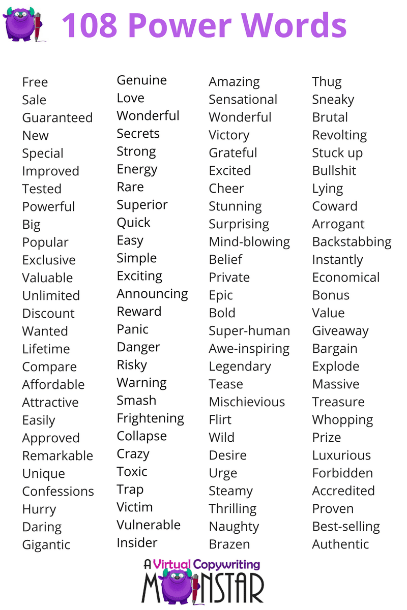
Here are 108 power words compiled by Sleeknote that would help you make your CTA button phrases more impactful:

9. Create Some Urgency
We all have massive FOMO. Your target audience does too.
Use this fear of missing out to your own advantage.
Limited-time or deadline-based offers convert so much better. There’s a reason why Amazon bets heavy on this!
“Get It Before Offer Expires” “{Price} (Limited-Time Deal)”
“Now” “Today” “Expires Soon” “Don’t Miss Out”
There are several words and CTA button phrases that you can use to trigger visitors to take action.
A countdown timer accompanying the button is even better.
Two Important Things To Have
Know that for your CTA button to work and drive conversion, you need to do two most fundamental things correctly…
(i) You need your landing page copy to be relevant, interesting and compelling.
If what you’re saying on the page isn’t good, your CTA button will not help. Period.
(ii) Your landing page should perform well to deliver visitors good user experience.
Foremost, it must load fast. Second, it should be mobile-friendly. Third, there are should be adequate and relevant navigations.
In short, the landing page performance should be great.
If your landing page has these two components, only then will your killer CTA button do its job optimally.
Do It Now
Now you know how to create CTA button that drives higher conversion, whadya waiting for?!
Do it.
Improve your call-to-action game and increase your conversion rate.
P.S.S. If you’re wondering how to make a CTA button in HTML and CSS, use Best CSS Button Generator.
And oh, if you have the time, give this post a read: 5 Data-Driven Lead Generation Hacks
I believe the post will bring you a lot of value if you’re trying to generate more leads.
(If you don’t have the time, bookmark the URL! :))
That’s all for now.
All the best!
